The addictive thing about typeface design is investing hundreds of hours before you can find out if its any good at all. Seriously. I hope it is good. It might possibly be good. But in that glorious moment when you set your first paragraph, you discover what the typeface truly is.
A Fontastic Journey
Typeface design started when I took a few classes at School of Visual Arts to fill the gaps between freelance jobs. My instructor was the legendary Ed Benguiat of PLINC fame. In addition to his wealth of typographic knowledge, he was always ready with hilarious advice: “If you want to do it wrong, keep doing what you’re doing. It might be a good idea because sometimes wrong is right.” I discovered typeface design is a lousy way to make a $5 in royalty payments, but I learned quite a bit about typography. I still try to find opportunities to sneak in some typeface design. For example, the font you’re reading right now is an unfinished typeface called Oregano Sans in four weights which i started almost a decade ago.
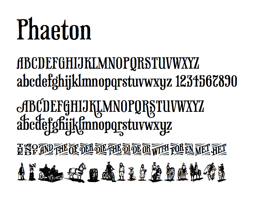
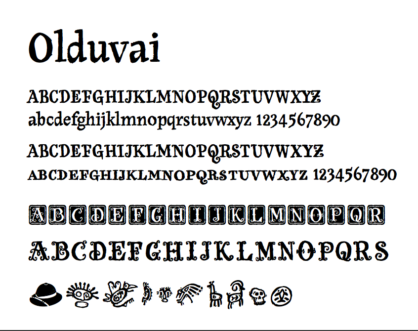
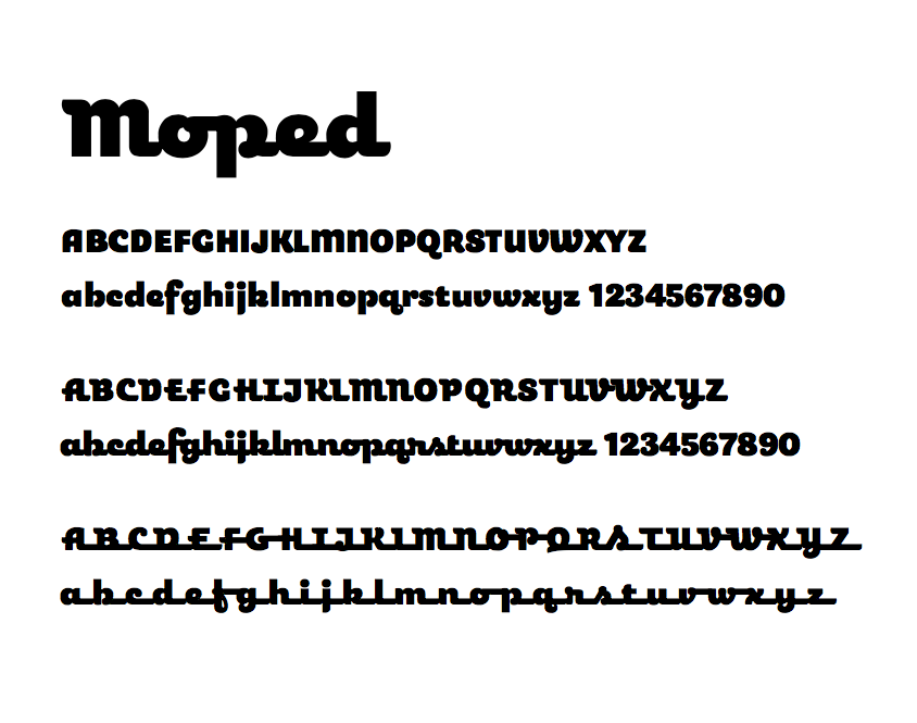
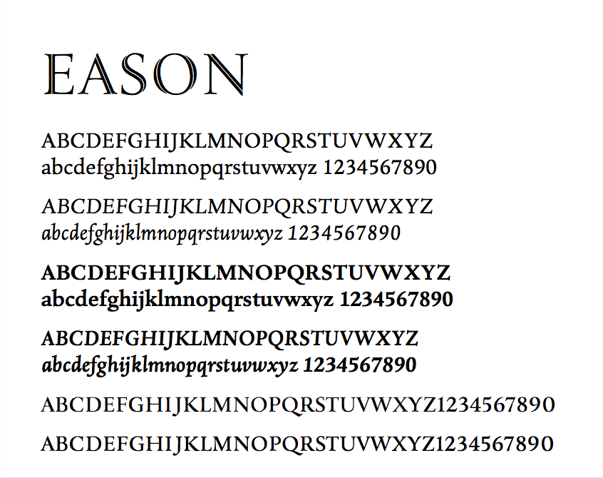
Commercial Typefaces